Name
Wise Table
Context
Food & Grocery Branding
Period
2025
Category
Branding
Package






01 Brand Direction
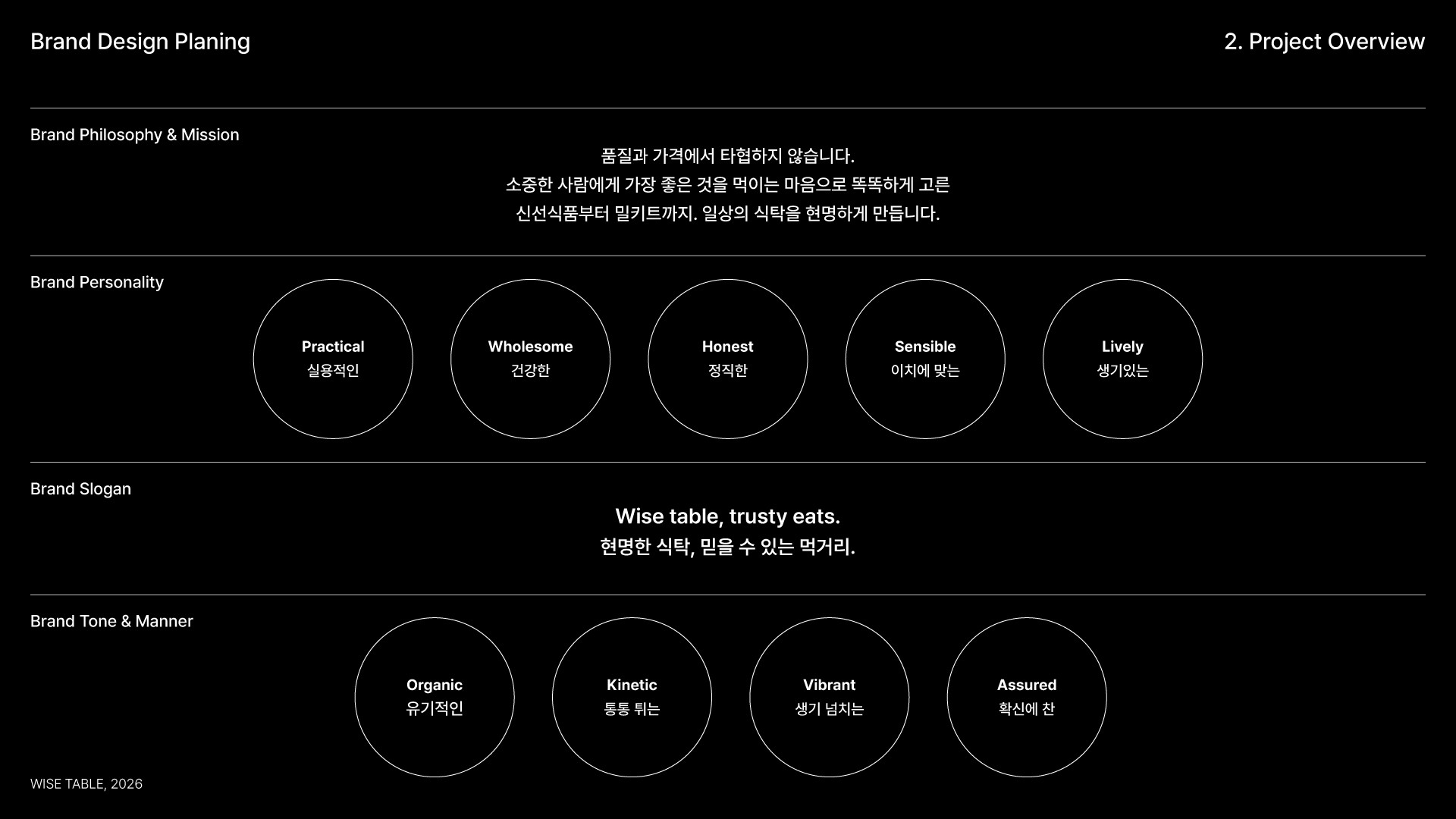
Wise Table은 ‘식재료부터 요리까지, 일상의 식탁을 채우는 현명한 선택지’라는 방향으로 정리했습니다. 너무 프리미엄하게 보이기보다는 일상적이고 접근 가능해야 했고, 동시에 저가형 PB처럼 가볍게 보이지 않도록 기본적인 신뢰감과 정돈된 인상을 유지해야 했습니다.
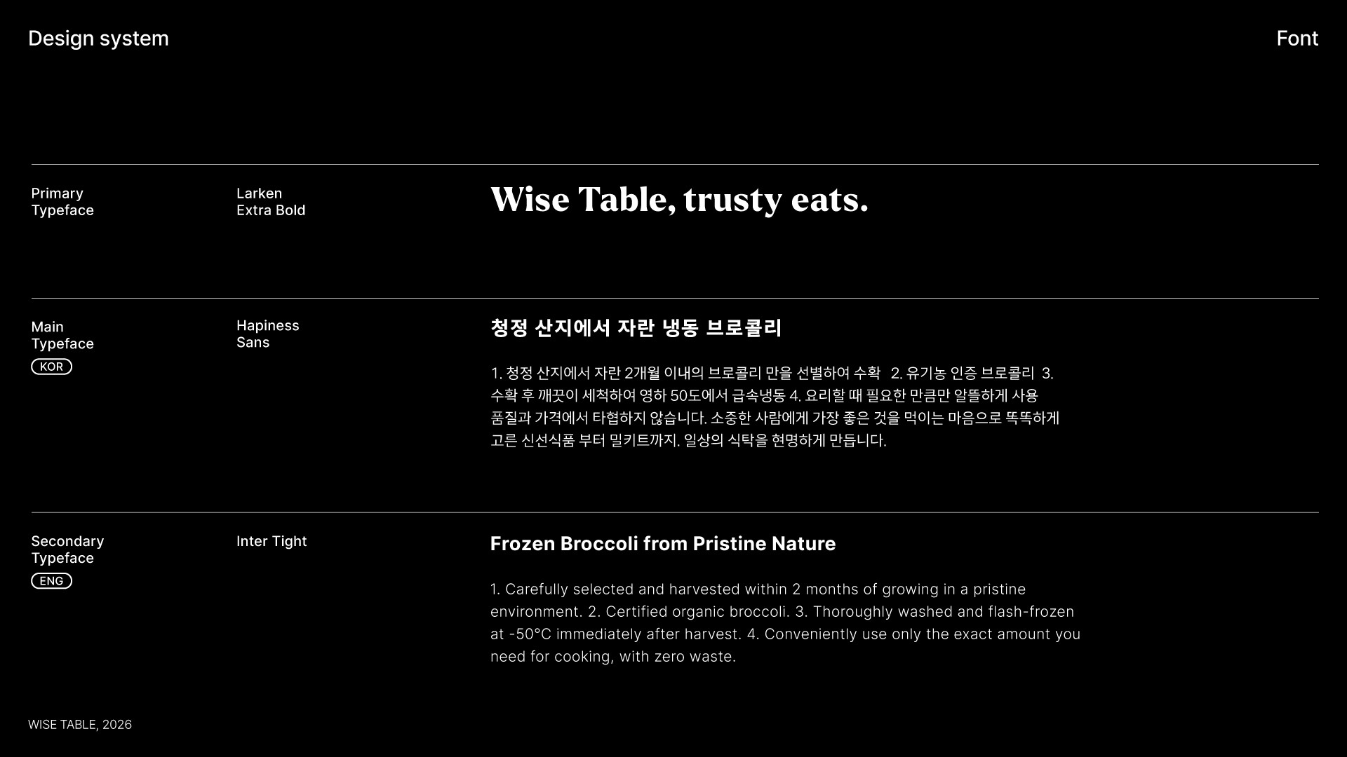
워드마크는 기존 식품 브랜드가 가진 정성과 신뢰감을 유지하면서도, 현대적인 미식의 즐거움과 간편함을 함께 담기 위해 모던 세리프 스타일로 설계했습니다. 지나치게 전통적이거나 장식적으로 보이지 않도록 세리프의 인상은 절제하고, 식품 브랜드로서의 부드러움과 안정감이 함께 느껴지도록 정리했습니다.
브랜드 심볼은 워드마크의 'T'에서 모티프를 가져와 만들었습니다. 'Table'이라는 이름이 가진 식탁의 이미지를 직접적으로 설명하기보다, T의 상단 구조를 테이블 상판처럼 해석해 브랜드의 핵심 장면을 단순한 조형으로 압축했습니다. 이 심볼은 로고의 일부이면서 동시에 패키지 그래픽과 투명창 구조로 확장될 수 있는 연결점이 되었습니다.
02 Package System
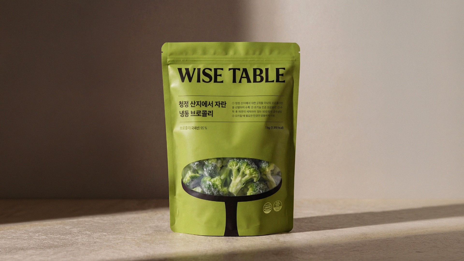
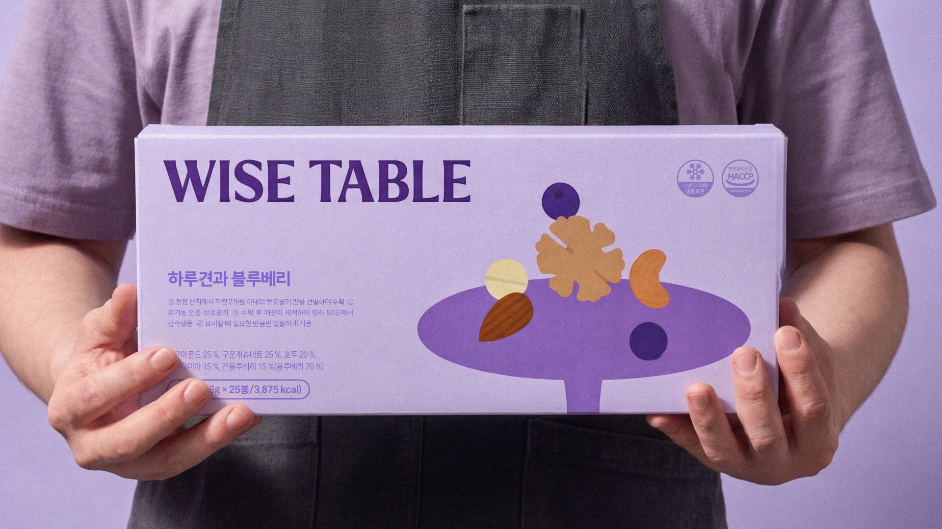
패키지 시스템에서는 부자재 비용을 낮추기 위한 목표가 있어 낮은 인쇄 도수 안에서도 식품다운 매력을 살리는 것을 핵심 과제로 정했습니다. 인쇄도수를 많이 소모하는 제품사진을 사용하는 방식 대신, 투명창을 통해 실제 제품이 직접 보이도록 하고, 주변에는 단순한 컬러와 그래픽 요소를 배치했습니다. 제품 자체가 가장 강한 이미지가 되도록 만든 것입니다. 인쇄도수에서 자유로운 지류인쇄에서는 미니컬하고 컬러풀한 그래픽 요소들을 메인으로 배치하여 제품 내부는 보여지지 않아도 감각적이고 기대감 높은 식품 패키지를 연출하고자 했습니다.
투명창의 형태는 Wise Table 심볼의 상판 형태와 연결되도록 설계했습니다. 로고에서 출발한 조형이 패키지의 구조로 이어지면서, 브랜드 심볼이 단순한 장식이 아니라 실제 제품을 보여주는 창의 역할까지 하도록 구성했습니다. 이를 통해 제한적인 인쇄 조건 안에서도 브랜드의 일관성과 식품의 직관적인 매력을 함께 전달할 수 있었습니다.
이 방식은 생산 비용을 크게 높이지 않으면서도, 소비자가 제품의 맛과 상태를 직접 확인할 수 있다는 장점이 있었습니다. 그래픽은 과하게 설명하기보다 제품의 성격을 빠르게 인식시키는 역할에 집중했고, 컬러는 카테고리와 맛의 인상을 구분하는 장치로 활용했습니다.
03 Outcome
Wise Table은 제한적인 인쇄 조건과 넓은 식품 카테고리 커버라는 두 가지 조건을 동시에 해결하기 위한 브랜딩 작업이었습니다. 기존 브랜드의 인지적 연결은 유지하되, 식품 브랜드로서 독립적으로 작동할 수 있는 이름과 시각 체계를 만들고자 했습니다.
결과적으로 사진 중심의 식품 패키지가 아니더라도, 투명창과 미니멀한 그래픽, 강한 워드마크를 통해 감각적이고 먹음직스러운 인상을 만들 수 있는 방향을 제안했습니다. 이 프로젝트는 비용 제약을 단순한 한계로 받아들이기보다, 브랜드의 차별적인 패키지 언어로 전환하려는 시도였습니다.
-
01 Brand Direction
Wise Table was designed as an everyday food brand that could cover a wide range of categories, from ingredients to prepared meals. It needed to feel accessible and practical, while still maintaining a sense of trust and refinement.
The wordmark uses a modern serif style to balance the warmth of traditional food brands with a more contemporary sense of dining and convenience. The brand symbol was developed from the “T” in the wordmark, interpreting its top structure as a tabletop. This motif later extended into the package graphics and transparent window structure.
02 Package System
The package system was built around limited printing conditions. Instead of relying on product photography, transparent windows were used to show the actual product directly, while simple colors and minimal graphics supported the layout.
The window shape was connected to the tabletop form of the Wise Table symbol, allowing the brand motif to work as both a graphic identity and a functional structure. For paper-based packaging, more colorful graphic elements were used to create appetite and expectation without showing the product itself.
03 Outcome
Wise Table solved two key conditions: limited printing specifications and the need to cover a wide food category. By combining a strong wordmark, transparent windows, and minimal graphics, the system created an appetizing package language within cost constraints.
Art Direction: Lee Hangyeol
Design: Lee Hangyeol, Kang Jina
Photography: Park Hojun, Jung Sooyeon