Name
Healthcare
Context
Healthcare Product Package & design
Period
2023-2026
Category
Package








01 Role & Scope
패키지 디자인 전개, 정보 위계 정리, 표시사항 검토, 양산 검수까지 전반적인 디자인 과정을 리드했습니다. 헬스케어 제품은 기능성 정보, 원료명, 섭취량, 용량, 주의 문구 등 필수 정보의 비중이 높기 때문에, 디자인 완성도와 정보 가독성 사이의 균형을 중요하게 보았습니다.
제품마다 전달해야 하는 정보량은 다르지만, 소비자가 가장 먼저 확인해야 하는 제품명, 핵심 기능, 섭취 목적, 제형 정보가 전면에서 명확하게 읽히도록 레이아웃 기준을 정리했습니다.
02 Category Approach
건강기능식품 시장은 성분 트렌드의 변화가 빠르고 특정 원료나 기능이 주목받기 시작하면 시장 전체가 비슷한 컬러와 시각 언어로 빠르게 반응하는 경향이 있습니다. 유산균, 비타민, 콜라겐, 수면, 이너뷰티처럼 소비자가 이미 특정 인상으로 기억하고 있는 제품군에서는 그 익숙한 신호를 완전히 무시하기 어렵습니다. 카테고리 내에서 형성된 시각 트렌드는 최대한 활용하여 소비자가 빠르게 알아볼 수 있는 익숙함은 유지하되, 제품명과 기능 정보, 성분의 우선순위, 컬러 사용 방식은 각 제품의 목적에 맞게 재설계했습니다. 너무 의약품처럼 보이면 거리감이 생기고 반대로 감성적 요소가 부각되면 신뢰도가 약해질 수 있습니다. 이 사이의 적절한 균형을 잡는 것 또한 중요하게 생각했습니다.
03 Applications
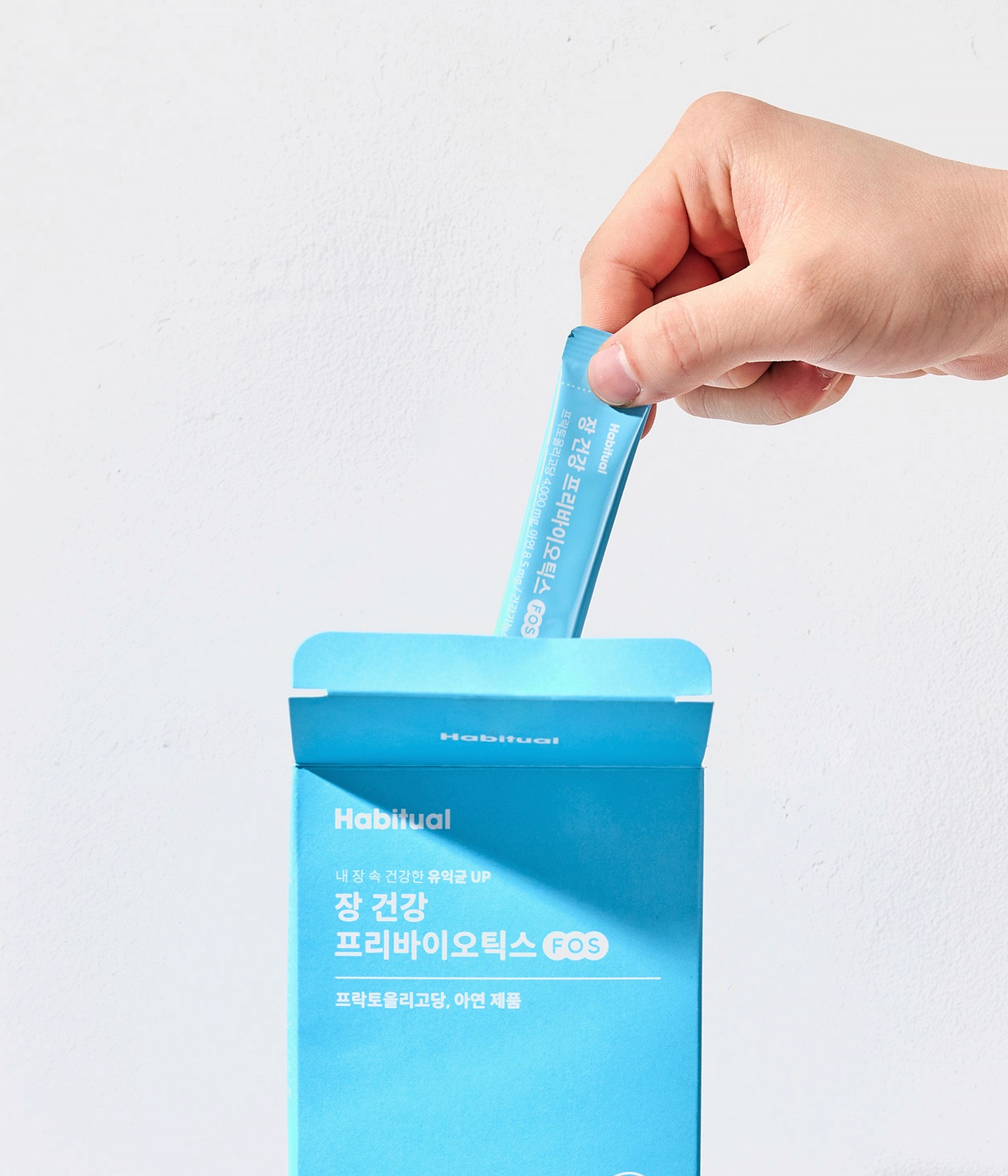
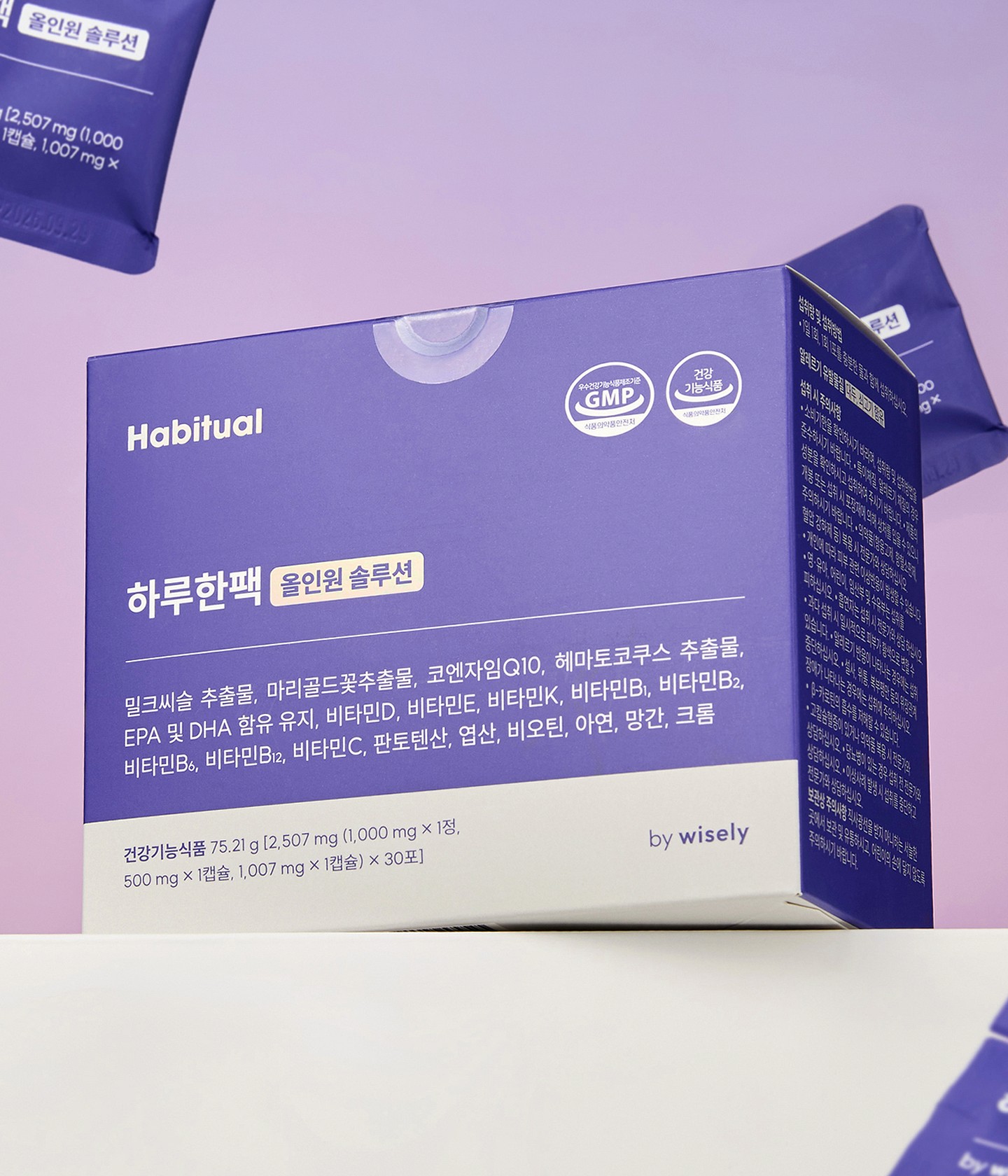
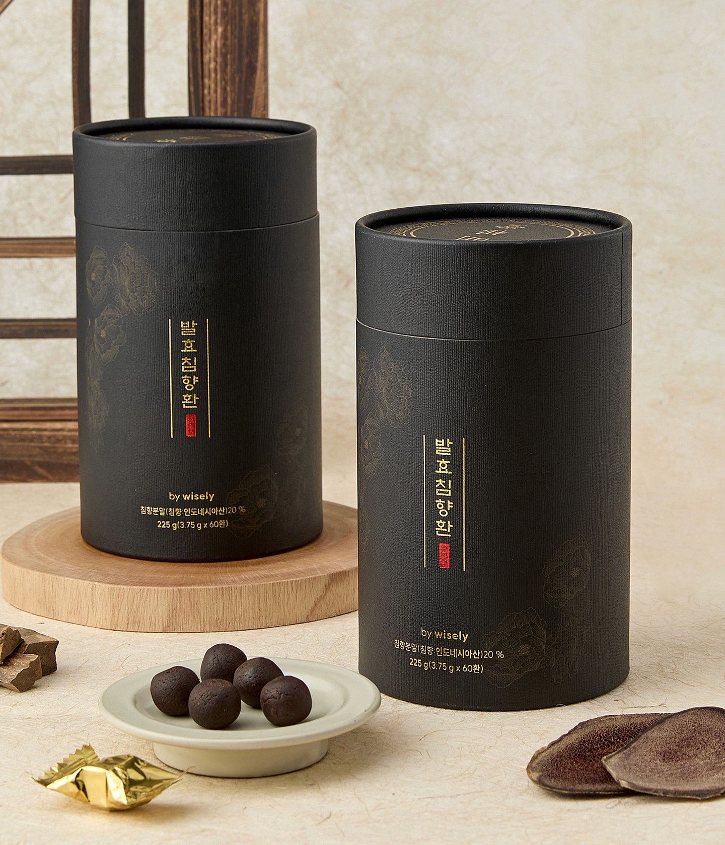
아래 작업물들은 성분과 기능이 다른 헬스케어 제품들을 각 제품의 성격에 맞게 풀어낸 예시입니다. 유산균, 비타민, 콜라겐, 수면 보조 제품처럼 시장에서 이미 특정 컬러와 인상으로 기억되는 제품군이 종종 있습니다. 이런 시그널은 디자인에 적극 반영하되, 브랜드의 시각적 허용 범위 바깥으로 너무 분산되어 보이는 것을 방지하고자 세부 레이아웃과 규칙의 교집합을 만들어 활용하였습니다.
타이포그래피와 정렬 방식은 제품별 컨셉과 패키지 스펙에 맞춰 유연하게 선택했습니다. 어떤 제품은 기능명이 먼저 읽히는 구성이 필요했고, 어떤 제품은 성분이나 섭취 맥락을 더 앞세우는 편이 자연스러웠습니다. 하드웨어의 폭과 높이에 따라 디자인 정렬 방식을 유연하게 적용하여 이점이 더 부각될 수 있도록 했습니다. 대신 컬러 운용, 그래픽 톤, 정보의 우선순위처럼 제품군 전체를 지탱하는 요소들은 일정한 기준 안에서 관리했습니다.
-
01 Role & Scope
I led the design process from package development and information hierarchy to labeling review and production check. Since healthcare products carry a high volume of required information, I focused on balancing visual quality with readability.
Across different products, I organized the front layout so that product names, key functions, intake purpose, formula type, and volume could be understood clearly and consistently.
02 Category Approach
The health supplement market reacts quickly to ingredient trends. When certain ingredients or functions gain attention, similar colors and visual cues often appear across the category. For products like probiotics, vitamins, collagen, sleep support, and inner beauty, these familiar signals are difficult to ignore.
Instead of avoiding them, I used these category cues as a starting point and redesigned them through the brand’s own standards. The aim was to keep the product easy to recognize, while adjusting the hierarchy of product names, functions, ingredients, and color usage according to each product’s purpose.
I also considered the balance between trust and accessibility. If the package looks too medical, it can feel distant. If it becomes too emotional, it can lose credibility.
03 Applications
The works below show how different healthcare products were developed according to their own ingredients, functions, and usage contexts. Familiar category signals were reflected in the design, while detailed layout rules helped keep the lineup from becoming too visually scattered.
Typography and alignment were adjusted flexibly based on each product’s concept and package format. Some products needed the function to stand out first, while others needed to emphasize ingredients or intake context. At the same time, color usage, graphic tone, and information priority were managed within a consistent visual boundary.
Art Direction: Lee Hangyeol
Design: Lee Hangyeol, Kang Jina, Yoon Wonjae
Photography: Park Hojun, Jung Sooyeon